Zed Pet Apparel
Zed Pet Apparel is an independently owned sewing business, focused on creating pet apparel for dogs all shapes and sizes.
The business was inspired by the owner’s great dane, Diego, who would have trouble with finding coats large and durable enough to last the winter. Sadly, Diego passed away due to health complications not too long after the business's founding.
For the business logo, the owner wanted to immortalize Diego and have him as the face of Zed Pet Apparel.
Using a beloved image from the owner, I created a playful logo that reflects not only the business, but most importantly, Diego’s character and liveliness.

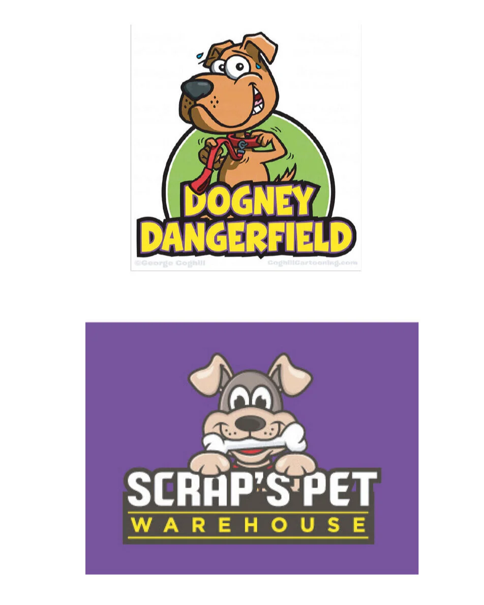
Some images that reflected the fun illustrated style to explore for the logo.

Included are some key words to for the logo to remind me to keep that feeling for the logo ideas and Diego’s illustration.
The reference photo of Diego was mainly used to ensure I have a more solid understanding of his face shape in case I was required to make a complete cartoon style of Diego like the logo reference images to the left.
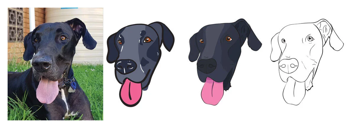
The final reference photo that the client wanted to use for the logo.
I explored different styles from cartoon to detailed to see how much detail is required to show Diego needs to be recognized.
I tested and used these to explore the colour palette how much colour detail would be required.
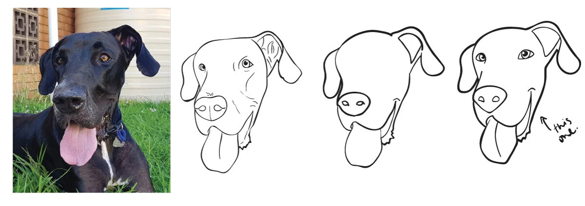
My second attempt of style exploring. The final illustration is a nice in between from the detailed to a cartoon illustration. It’s simplistic enough to get the right mood from the key words happy, friendly and warm.
The final illustration for the icon.
For the text, I required a playful yet serious combination of fonts that is reflective of the business and would go well with the final illustrated icon. The font for “Zed Pet” reflects the playful feeling but it reflects the bounciness and liveliness of Diego and dogs in general.
At this point, the client had informed me that she has a secondary business focused on human clothing, so the choice of the secondary font was specifically chosen to be interchangeable and recognizable for both of the brands. As she is very passionate about her businesses, I thought it was very appropriate to tie in a more serious and professional looking typeface to compliment the logo.
The use of the dashed line was also used to tie in and distinguish the playfulness and seriousness of the two typefaces. I wanted a small accent piece that can be used freely to tie in the the final logo together in different ways and used for the secondary business as well. The choice of the dashed line was specifically chosen as a nod to the sewing used for each of the handmade pieces.
The final logo designs for the client.